Controls
Author
MovTery - 2025/11/4
Control layouts interact with the game through controls. Currently, the control layout editor includes two types of controls: buttons and text boxes.
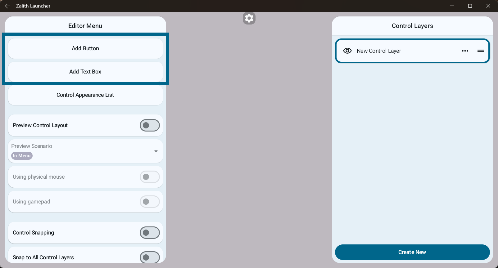
All controls must be placed on a control layer. You need to select a control layer before adding controls.
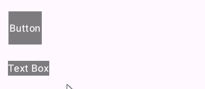
Controls can be repositioned by dragging:
Text Box
The text box is the most basic control, used to display text content and set basic control properties.
Text boxes do not respond to touch events and are for visual display only.
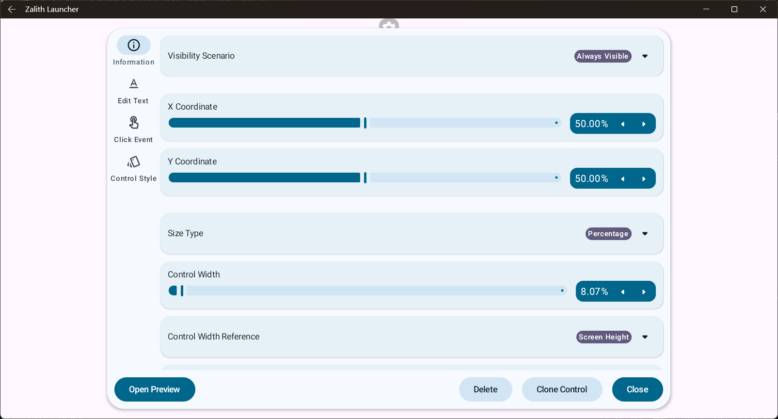
In the editor, you can set the following properties for text boxes:
- Information
- Edit Text
- Control Style
The default size type of a text box is Wrap Content, and it comes with a default control style.
Button
A button is a variant of a text box and inherits all its functions.
Unlike a text box, a button can respond to touch events and has two states: pressed and released.
In the editor, you can set the following properties for buttons:
- Information
- Edit Text
- Click Event
- Control Style
The default size type of a button is Percentage, with width and height dynamically determined by the device screen, and it comes with a default control style.
Editing Controls
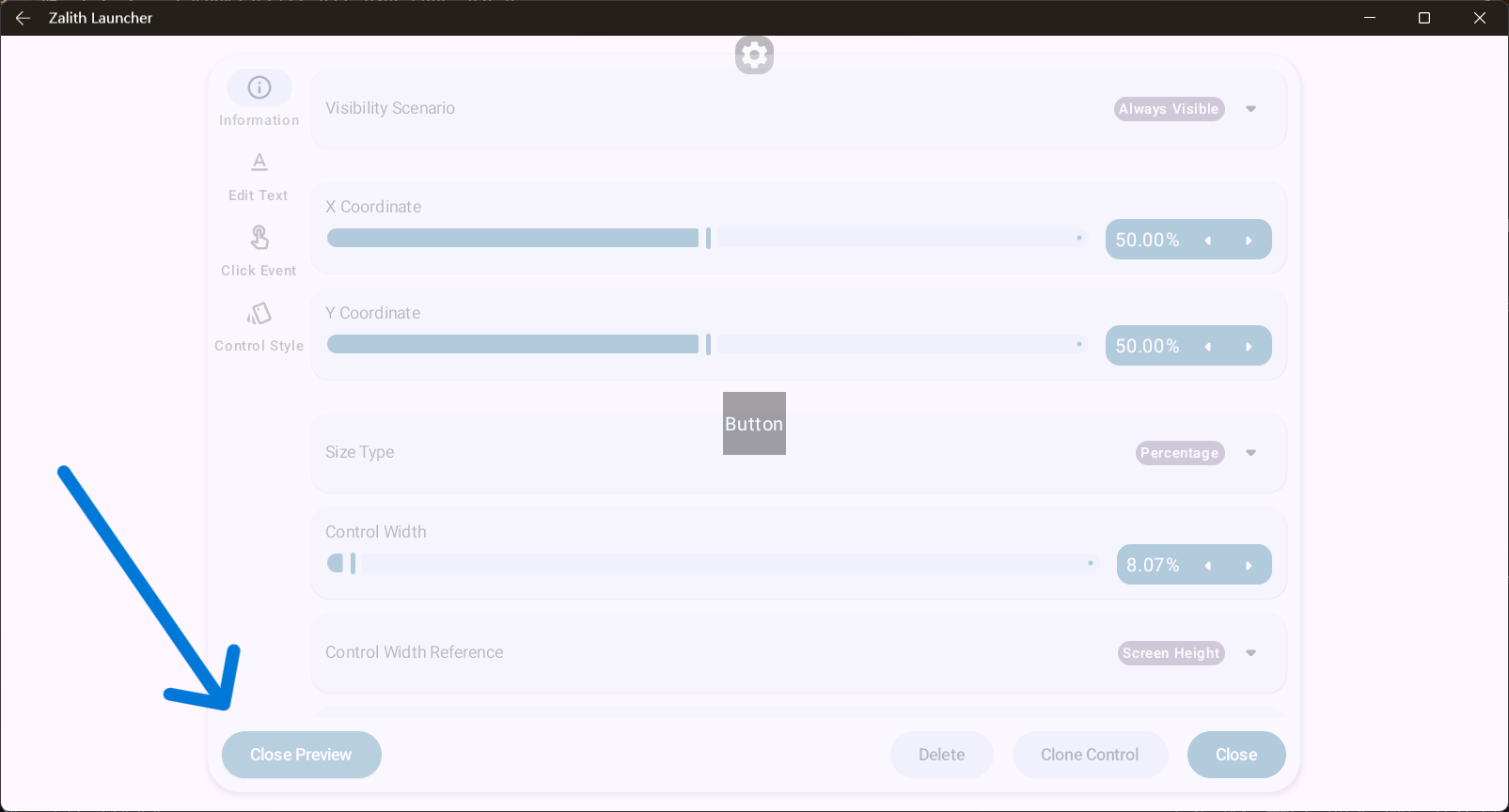
In the editor, you can click on a control to open its edit menu:
In the control edit menu, you can enable preview mode, making the menu semi-transparent to more clearly view changes to the control: